Box
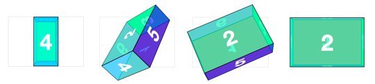
Cube objects are easy enough to generate as we only have to worry about one measurement. But how would we handle a non-regular rectangular prism? Or, as the kids say, a box. Let’s try to make one 300px wide, 200px high, and 100px deep.
The markup remains the same.
<div class="scene">
  <div class="box">
    <div class="box__face box__face--front">front</div>
    <div class="box__face box__face--back">back</div>
    <div class="box__face box__face--right">right</div>
    <div class="box__face box__face--left">left</div>
    <div class="box__face box__face--top">top</div>
    <div class="box__face box__face--bottom">bottom</div>
  </div>
</div>
The CSS the same as the cube’s, with size values changed: width: 300px, height: 200px and translateZ(-50px) on the .box as its 100px deep.
.scene {
  width: 300px;
  height: 200px;
  perspective: 500px;
}

.box {
  width: 300px;
  height: 200px;
  position: relative;
  transform-style: preserve-3d;
  transform: translateZ(-50px);
}

.box__face--front,
.box__face--back {
  width: 300px;
  height: 200px;
}

.box__face--right,
.box__face--left {
  width: 100px;
  height: 200px;
}

.box__face--top,
.box__face--bottom {
  width: 300px;
  height: 100px;
}With position: absolute applied to the faces, they all collapse to the top left corner of .box.
In order to translate out the faces from the center of the box in 3D, we need to center the faces. We can do this by adding top and left position styles. .box__face--left and .box__face--right need to be positioned left: 100px. .box__face--top and .box__face--bottom need to be positioned top: 50px.
.box__face--right,
.box__face--left {
  width: 100px;
  height: 200px;
  left: 100px;
}

.box__face--top,
.box__face--bottom {
  width: 300px;
  height: 100px;
  top: 50px;
}To position the faces in 3D, the rotate values all can remain the same as in the cube example, but for this rectangular prism, the translate values differ. The front and back faces each are shifted out 50px since the box is 100px deep. Left and right faces translate is 150px for 300px width. Top and bottom panels go 100px for the 200px height.
.box__face--front  { transform: rotateY(  0deg) translateZ( 50px); }
.box__face--back   { transform: rotateY(180deg) translateZ( 50px); }

.box__face--right  { transform: rotateY( 90deg) translateZ(150px); }
.box__face--left   { transform: rotateY(-90deg) translateZ(150px); }

.box__face--top    { transform: rotateX( 90deg) translateZ(100px); }
.box__face--bottom { transform: rotateX(-90deg) translateZ(100px); }Just like the cube example, to expose a face, the #box needs to have a style to reverse its face’s transform. Both the translateZ and rotate values are the opposites of the corresponding face.
.box.show-front  { transform: translateZ( -50px) rotateY(   0deg); }
.box.show-back   { transform: translateZ( -50px) rotateY(-180deg); }
.box.show-right  { transform: translateZ(-150px) rotateY( -90deg); }
.box.show-left   { transform: translateZ(-150px) rotateY(  90deg); }
.box.show-top    { transform: translateZ(-100px) rotateX( -90deg); }
.box.show-bottom { transform: translateZ(-100px) rotateX(  90deg); }