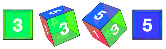
Cube
Cards are a good start for working with 3D transforms, but they only show off 3D in transition. To show off 3D at rest, we’ll have to create true 3D objects: prisms. We’ll start with a cube.
The markup for the cube is similar to the card. This time we need 6 child elements for all 6 faces of the cube.
<div class="scene">
  <div class="cube">
    <div class="cube__face cube__face--front">front</div>
    <div class="cube__face cube__face--back">back</div>
    <div class="cube__face cube__face--right">right</div>
    <div class="cube__face cube__face--left">left</div>
    <div class="cube__face cube__face--top">top</div>
    <div class="cube__face cube__face--bottom">bottom</div>
  </div>
</div>Basic position and size styles set the 6 faces on top of one another in the container.
.scene {
  width: 200px;
  height: 200px;
  perspective: 600px;
}

.cube {
  width: 100%;
  height: 100%;
  position: relative;
  transform-style: preserve-3d;
}

.cube__face {
  position: absolute;
  width: 200px;
  height: 200px;
}Now all the faces are placed on top of one another, ready to be rotated. .cube__face--top and .cube__face--bottom will use rotateX() so they are rotated around the vertical X axis.
.cube__face--front  { transform: rotateY(  0deg); }
.cube__face--right  { transform: rotateY( 90deg); }
.cube__face--back   { transform: rotateY(180deg); }
.cube__face--left   { transform: rotateY(-90deg); }
.cube__face--top    { transform: rotateX( 90deg); }
.cube__face--bottom { transform: rotateX(-90deg); }(We could remove the rotateY( 0deg) style, as this transform has no effect, but let’s leave it in for consistency.)
Now that faces are rotated, only the front and back faces are visible. The 4 side faces are all perpendicular to the viewer, so they appear on-edge, near-invisible. To push them out to their appropriate sides, they need to be translated out from the center of their positions. Each side of the cube is 200px wide. From the cube’s center they’ll need to be translated out half that distance, 100px.
.cube__face--front  { transform: rotateY(  0deg) translateZ(100px); }
.cube__face--right  { transform: rotateY( 90deg) translateZ(100px); }
.cube__face--back   { transform: rotateY(180deg) translateZ(100px); }
.cube__face--left   { transform: rotateY(-90deg) translateZ(100px); }
.cube__face--top    { transform: rotateX( 90deg) translateZ(100px); }
.cube__face--bottom { transform: rotateX(-90deg) translateZ(100px); }Note here that the translate function comes after the rotate. The order of transform functions is meaningful. Each face is first rotated towards its position, then translated outward in a separate direction.
We have rendered a cube, but we’re not done yet.
Un-fuzzing 3D transformed text
Take another look at the text “front” in the above cube. It’s fuzzy.
3D transforms affect text rendering. When you apply a 3D transform, browsers take a snap-shot of the element and then re-render those pixels with 3D transforms applied. As such, fonts don’t have the same anti-aliasing given their transformed size.
For the sake of our users, 3D transforms should not distort the interface. To resolve the distortion and restore pixel perfection to our cube, we can push back the 3D object, so that the front face will be positioned back at the Z origin.
.cube { transform: translateZ(-100px); }Rotating the cube
To expose any face of the cube, we’ll need a style that rotates the cube to show that face. The transform is the opposite of the corresponding face. We toggle the necessary class on the .cube to apply the appropriate transform.
.cube.show-front  { transform: translateZ(-100px) rotateY(   0deg); }
.cube.show-right  { transform: translateZ(-100px) rotateY( -90deg); }
.cube.show-back   { transform: translateZ(-100px) rotateY(-180deg); }
.cube.show-left   { transform: translateZ(-100px) rotateY(  90deg); }
.cube.show-top    { transform: translateZ(-100px) rotateX( -90deg); }
.cube.show-bottom { transform: translateZ(-100px) rotateX(  90deg); }
Notice how the order of the transform functions has reversed. First we push the object back with translateZ, then we rotate it.
Finishing up, we can add a transition to animate the rotation between states.
.cube { transition: transform 1s; }